I am using PS CS5 but this of course can be used in other versions of Photoshop.
I have turned on the Pixel Grid to make things easier, to do this click: View > Show > Pixel Grid.
I also use the Rulers found in the View menu.
Step 1
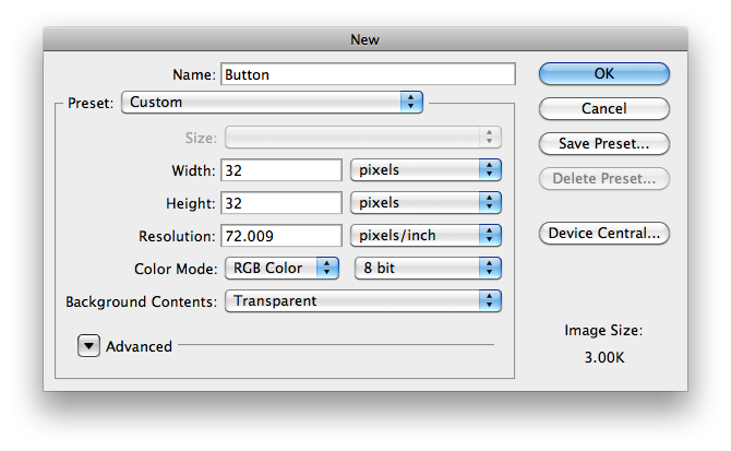
- Open Photoshop and select, File > New. In the New Dialog box set the following:
- Once The new window is open pull out guide lines from the top and the side to find centre.
Step 2
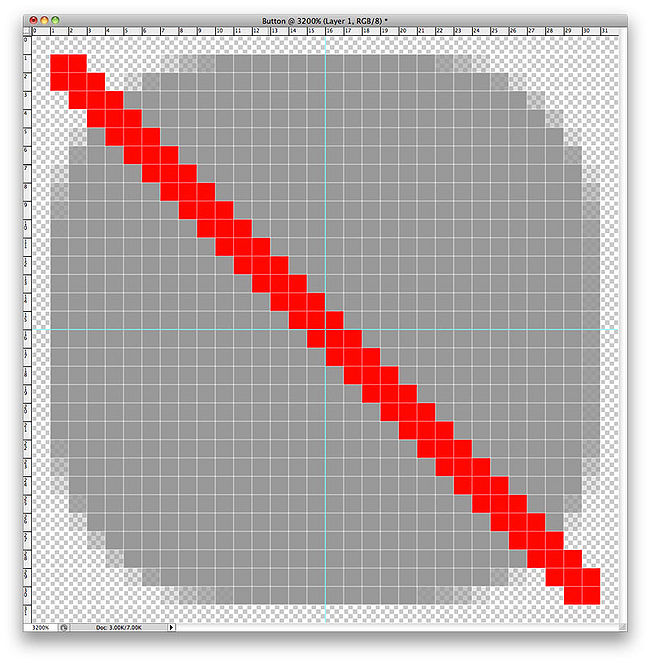
- Name the first layer Background. Open the colour picker and select Only Web Colours, use colour #999999 and make sure anti – aliasing is selected. Select the Rounded Rectangle tool, hold down Shift and draw out the shape going diagonally from top left down to bottom right. Start with one square in and end one square in from the bottom as shown by the red line below.
Step 3
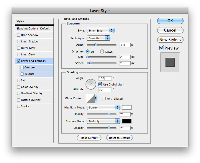
- Add New Layer and call it Button Face. Change the colour to white #ffffff making sure that the Rounded Rectangle tool is still selected and anti – aliasing, draw another rectangle, but this time from three squires in from the top and bottom. Click on the FX button and select Bevel and Emboss and use these settings.
Step 4
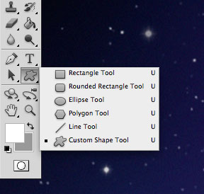
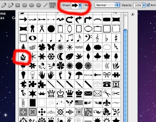
- Add a new layer and call it Hotspot. Change to the Custom Shape Tool.
- Then choose the Fire image.
- Change the colour to #999999 and draw the image on the button.
- Centre the button so it looks in the centre rather than using the centre lines.
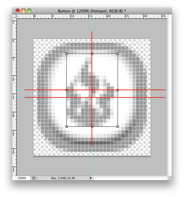
- At this point add another alignment line, click on the selection tool to see the centre of the Fire graphic and click in the top ruler bar and drag down a new line to centre of the Fire image. I have highlighted the lines in red so you can see what you should end up with, the top horizontal red line is the Fire graphic centre while the lower horizontal red line is the button centre. The vertical line is common to both.
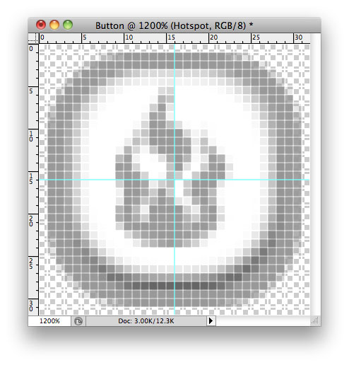
- That basically is the button in the up state.
- Click File > Save For Web and Devices, make sure you have PNG-24 selected and save it as Hotspot Up
Step 5
- To create a hover state, go back to the Background layer and click FX Colour Overlay and select #333333. Now do the same thing as above, Click File > Save For Web and Devices but this time save as Hotspot hover.
Step 6
- The click state is a little more tricky, go back to the button face layer and open the FX Bevel and Emboss, click the Direction from Up to Down. The button looks as if it has gone in, but if you look the Fire graphic is now too high.
Step 7
- Select the Hotspot layer and click on the selection tool. You need to move the Fire graphic down to the button centre, the lower horizontal alignment line. Now add Colour Overlay from the FX menu. Select colour #666666. This will darken the Fire graphic.
- The idea is that when a button is clicked in, it is now more in shadow and will appear darker. Click File > Save For Web and Devices and save as Hotspot Click.
- All you need to do to return back to the up state is turn off the background layer FX, set the button face layer to Direction Up, and turn off the FX on the hotspot layer, then return it back to the upper horizontal line.
- To add more just add a new layer for each button function and follow the same rules as above. Of course adding colour overlay FX means you can change The colours to what ever you want.
- Try experimenting with different sizes and using different drawing tools such as the eclipse tool to make round buttons.
- You do not have to have the click state, sometimes less is more so just an up and hover state may be enough for your projects. With buttons for I Phones you will need to increase the size, 50 x 50px because of the higher resolution screen.
- The above is a basic example, but hopefully you can build on this to create your own buttons.
