Loading bars visually indicate how much of the project has loaded. There is a pre-installed loading bar skin default_loading.ggsk which you can edit (Go to Elements > Add Default Loading Bar). However, in the case you’d like to know how it was created you can follow the tutorial:
Part 1 – Building the loading bar
- Open a new Skin Editor document or an existing project.
- Use the Rectangle Tool,
 , to draw a long, thin rectangle (this is the loading bar).
Make any further size adjustments to the rectangle by dragging on its handles.- ◊ TIP: Draw the rectangle to the desired full length of the loading bar.
- Select the rectangle in the Editor or in the Tree to open its settings in the Properties section.
- Animate the bar to grow from left to right:
- Open the Appearance panel.
- Change the Scaling’s Center position to center-left.
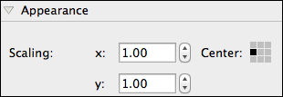
◊ NOTE: If Scaling is left in the center, the bar will scale out to both the left and right.
◊ TIP: To have a partially transparent loading bar, change the Alpha value to something less than 1.000.
- Open the Rectangle panel and choose a background and border color (optional).
- Open the Actions panel and create an action to hide the loading bar when loading is done:
- For the Source, choose Loaded and Hide Element as the Action.
- In the Target field, leave the default value, $self.
- To have the loading bar move, or scale, in relation to how much of the movie has been loaded, open the Modifiers panel:
- Choose Scale X for the Target Value. This will make the rectangle expand (or move) along its X-axis.
- Choose Loading as the Source Value. This will cause the rectangle to animate in relation to loading time.
- To have the bar scale to its current length, keep the Factor at 1.000.
- To have the rectangle scale to twice its original size, for example, change the Factor to 2.000.
- If your loading object must be visible from the beginning, increase the Offset. For example, if you want a portion of the loading bar to be visible, choose an Offset of 1.
- Move on to Part 2 to add text.

Part 2 – Adding text
- Select the Text tool,
 .
. - Draw a text box in the Editor. Position it and size it accordingly.
- Add the text by doing one of the following:
- Double-click on the Text element in the Editor to make it editable and start typing or paste the text.
- Add the text in the Text panel of the Properties section.
- ◊ TIP: You can use basic HTML tags here.
- ◊ TIP: Use
$p, to represent the percentage of how much the movie has loaded. - ◊ TIP: Use the Live Preview to see how the text will look on output.
- On the Position panel, in the Properties section, give the text box an, ID. This is helpful if you have multiple text boxes and need to quickly distinguish between them.

- In the Text panel, you can change the text color and text alignment.

- In the Rectangle panel, disable the Background and change the Border to 0. (optional)

- In the Actions panel, add an action to hide the text after the movie is finished loading:
- Choose Loaded as the Source.
- Choose Hide Element as the Action.

- Select the Container tool,
 , and in the canvas, draw around the elements (the loading bar and the loading text box). They will become children of the Container.
 - Anchor the Container to an area of the window.
- Anchor the elements to the Container. The top left is a good start.
- Click Close and save your skin.
◊ TIP: Save it to the Skins directory to have it available in the menu in the Flash and HTML5 output settings. - Add your skin to a Flash or HTML5 output.


Learn more:
See also
The Interface (Skin Editor)
Skin Placeholders
Text Element Properties
Using the Skin Editor
All tutorials for the Skin Editor
| Previous: Build a Custom Controller | Next: Add Sounds to Buttons |