Video Element
Use this to add videos to your skin. You can use local files, URLs or YouTube and Vimeo IDs.
Add the Video skin element by doing any of the following:
-
Select it in the Toolbar and click and drag in the Canvas to add the element.
-
Go the Elements menu and select Video. Click and drag in the Canvas to add the element.
Video
Video Source
Choose the video’s source type:
-
File – To use a video from a local file. Pano2VR copies the file to the output. You can choose an optional poster frame (Poster Frame File), a preview image that is displayed until the video starts playing. Add the same video in other formats or resolutions as Alternative Files.
-
URL – To use a video from a URL. Enter the URL of the video and its Poster Frame URL. HLS streams (
.m3u8) are also supported and adapt the quality to the viewer’s network bandwidth. Browsers that cannot play HLS themselves load a small add-on player for it. -
YouTube – To embed a YouTube video. Paste the URL of a YouTube video into the YouTube ID field. When you do, you’ll see the video ID as a link. You can also add links with timestamps. Click on this to check it is the correct video (it opens the page in a browser). You cannot mute the audio of YouTube videos.
-
Vimeo – To embed a Vimeo video. Paste the URL of a Vimeo video into the Vimeo ID field. When you do, you’ll see the video ID as a link. Click on this to check it is the correct video (it opens the page in a browser). You cannot hide the Vimeo movie controls or mute the audio. To set a video in Vimeo to “unlisted”, select Hide this video from vimeo.com in the video’s Privacy settings.
Alternative Files
Available for the File source type. Not every browser plays every video format, so you can add up to three more files with the same video in other formats or resolutions. In the tour, the browser tries the main file first and moves on to the alternative files, in order, until it finds one it can play. Pano2VR copies all of them to the output.
- Click the folder icon to choose a file. A new empty row appears as soon as a row is filled.
- Click the gear icon to convert the main video file into another format and add the result as an alternative file. See Generate an Alternative Video File.
- Clear a row to remove that file. The files below it move up.
360 Video
This video element does not support 360º Video. If you’d like to add 360º video via the skin (that is, a video point hotspot), you can use a Text Field with an iframe set as the text.
If you’d like to use a point hotspot to open a 360º Video, you can use the component, Web Link and add your link to it and if necessary, swap out the icon.
Options
Not all options are available for all video source types.
-
Autoplay – To automatically start the video. Browsers only start a video on their own when it’s muted.
-
Controls – To show playback controls inside the video. Available for File, URL, and YouTube.
-
Loop – To continuously loop the video.
-
Mute – To mute the video’s audio. Available for File and URL.
Subtitles
Add a subtitle track to the video. Available for the File and URL source types; YouTube and Vimeo bring their own captions.
Subtitles – Choose where the subtitles come from:
- None – The video has no subtitle track.
- Automatic – Use a
.vttor.srtfile with the same name as the video file, in the same folder. Translated files with a language suffix, liketour_de.srt, are picked up as well and follow the tour’s language. Below the menu, Pano2VR shows the file it found, or No subtitle file found. Available for the File source type only. - File – Choose a specific subtitle file in Subtitle File.
SRT files are converted to WebVTT on output.
Show As – Choose how the subtitles appear:
- Skin text element – The tour writes the text of the current subtitle into the skin variable named in Text Variable. Show that variable in a text box to style the subtitles like the rest of your skin.
- Native captions – The browser draws the subtitles on the video. With Controls selected, viewers also get the browser’s captions menu.
Kind – Mark the track as Subtitles or Captions (captions also describe non-speech audio).
Text Variable – The text variable that receives the current subtitle when Show As is set to Skin text element. Type the name, or click the button next to the field to pick one of the skin’s text variables.
Loading
Unload video on hide – Select to unload the video when the element is hidden through a skin action. Available for all video source types.
Position
ID
Give the element a unique ID or name. An ID is given automatically and will be numerically ordered when more than one are added. If an ID is already used by another element, a warning symbol will appear next to the input field.
Point Hotspot Templates will have a menu that shows all the default template IDs as well as any template IDs used in the project.
Position
The X and Y coordinates for the element.
An element’s position is relative to its parent and to its anchored position (the Canvas is the parent to top level elements).
For example, a video that is anchored and placed in the middle of the Canvas
will have its anchor set to center and X and Y set to 0. So, if the
element is anchored to the horizontal center, the X coordinate is measured from
the center of the parent to the horizontal center of the element. Likewise, if
an element is anchored right, the x-coordinate is measured from the right side
of the parent to the right side of the element as indicated by the arrows.
0. This makes it easier to precisely position elements, especially on the edges of the player. For example, to keep an element positioned on the bottom center of the player and a certain distance from the edge, set the anchor to center bottom and set the Y value to 20 pixels and X to 0.X and Y:
-
Pixels – Unit to set the actual location of the element within the skin.
-
Percent – Unit to set the position of the element based on the size of its parent (the player window for top level elements).
-
CSS – Select CSS as a unit to allow for changing units when a logic block has been added or to use calculations.
- Example: Set the x position unit to CSS. Enter,
100pxin the edit field. Add a logic block, choose a trigger and add20%for the size, effectively switching units.
- Example: Set the x position unit to CSS. Enter,
Anchor
Use this grid to “stick” the element to a section of the player window. See above, to learn how the Anchor influences Position.
Size
The Hotspot Template and Node Marker do not have a size parameter.
Adjust the element’s size (width and height). Width and Height:
-
Pixels – Unit to set the actual size of the element.
-
Percent – Unit to set the size of the element based on the size of its parent (the player window for top level elements).
-
Lock Aspect Ratio – Click the link icon to lock the element’s size aspect ratio when resizing in the Canvas or changing size values in the properties panel. This button is reset to off when another element is selected.
-
CSS – Select CSS as a unit to allow for changing units when a logic block has been added or to use calculations.
- Example: Position an element 50 pixels from the top and then set the height
to
calc(100% - 50px). The element will then always have the same distance of 50px from the top and will extend straight down to the bottom.
- Example: Position an element 50 pixels from the top and then set the height
to
-
Reset Size – Available for Image, Button, and SVG elements. Click to return to the image’s original size.
-
Reset Size/2 – Available for Image, Button, and SVG elements. Use this when you want to add a PNG or JPG to your project but still want it looking sharp in Hi-DPI displays. For example, if the skin requires a 32px image, use a 64px image and then click, Reset Size/2. This will then make it 32px in the skin but will still have all the pixels for a high resolution display.
Appearance
Scaling
Scales the element along the x and y axes. Doubling the value on either axis, for instance, will double the size of the element. If a scaling modifier is enabled, this scaling setting is ignored.
Center
Use this grid to determine how the element scales. The default is set to the center so the element will scale in or out from its center. If you anchor the scaling to the upper left corner, for example, the scaling will center from this point.
Angle
Use this parameter to adjust the angle of the element. It will use the Center grid (above) as its axis. For example, if the center is chosen, it will rotate around its center. If the bottom left corner is selected, the button will rotate around that corner.
Visible
Select or deselect to keep the element visible or invisible. Visibility or invisibility can be changed and toggled with actions.
Alpha
The transparency of the element. A setting of 1.000 is opaque. Lowering this number will increase the elements’s transparency.
Cursor
Choose which cursor shows when the mouse rolls over the element.
Inherit – The element will inherit the cursor from its parent element. This is the default for all elements except Button and Seekbar.
Hand – The hand cursor will show. This is the default for Button and Seekbar elements. When selected, the cursor is not inherited from its parent element.
Default – Choose this option to force the browser’s default cursor (usually an arrow). When selected, the cursor is not inherited from its parent element.
Masking
Available for Container, Cloner, and Rectangle elements. Select Enabled to clip child elements at the element’s boundaries.
Accessibility
Tab Index
To make skin elements controllable via keyboard, they have to be added to the
tab order of the web page. A tab index of -1 (the default) excludes the
element from the tab order. A tab index of 0 includes the element in the tab
order. Values from 1 to 99 include it with an explicit position: the browser
visits those elements first, in ascending order. Browsers highlight the active
element by putting a rectangle around them. Once a skin element is the active
element, indicated by the highlight, press Return (macOS) or Enter (Windows) to
trigger its click action.
ARIA Label, Description, Details
These are attributes or properties that are used to define the element and support the Role.
ARIA Label – Defines or names the element.
ARIA Description – Provide a brief description of the element.
ARIA Details – Provide an extended, detailed description of the element. This field uses your system’s spell checker.
ARIA Role
ARIA roles are used to define UI elements (button, loading bar, and so on). Choose from the list which best defines the element, or type another role.
ARIA Hidden
Select to hide all ARIA attributes.
Advanced
Z-Index
Set the CSS z-index property. Use numbers to set the stacking order or leave the setting at Default. Default will use the stacking order set in the Tree.
This is used to ensure that elements are displayed in the correct stacking order especially when close or overlapping.
Use the Logic Block to change the Z-index value using variables, for example.
Permeable
Select to make sure the element does not accept mouse clicks. This is useful for when you want to include an element in the skin but don’t want it to hinder the ability to interact with the panorama. For example, you could add a vignette or logo or border that when clicked on, will allow interaction with the panoramas.
Proxy ID
Link the element to a hotspot or to an object in a 3D model, so that the element receives the same mouse and touch events: mouse click, mouse double-click, mouse enter, and mouse leave. The element responds with its own actions for those events, so it needs a matching action to react. For example, a text box with a Mouse Enter action that shows it and a Mouse Leave action that hides it can work as a tooltip for a hotspot.
Enter one of the following:
- The ID of a hotspot, from the ID field in the hotspot properties. See hotspot proxy ID.
- The name of an object in a 3D model node. Right-click the model tree in the Overview panel to copy an object’s name.
- A node ID in curly brackets, like
{node2}, to react to hotspots that link to that node. Learn more. - A
#followed by a regular expression, like#^info, to react to every hotspot or object whose ID matches. *to react to all of them.
CSS Classes
Enter the CSS class names for the selected element. You can enter more than one
class separated by spaces. If you need more space, click the Edit button to
the right of the field for a larger text field. No dot . needed.
Logic Block available. Use the Additive Mode, to apply different classes to the element. Every condition adds a class (or multiple classes) to the default list of classes set in the CSS classes property of the element or stylesheet. Classes set in the property are not replaced but rather added to.
CSS Styles
Enter the CSS style attributes for the selected element. You can enter more than one style separated by semi-colons. If you need more space, click the Edit button to the right of the field for a larger text field.
CSS Styles Inner Element
Enter CSS style attributes for the selected element’s inner element. (Some skin
elements, like Image, Video and External Image, have an inner element nested
inside the element’s main <div>.)
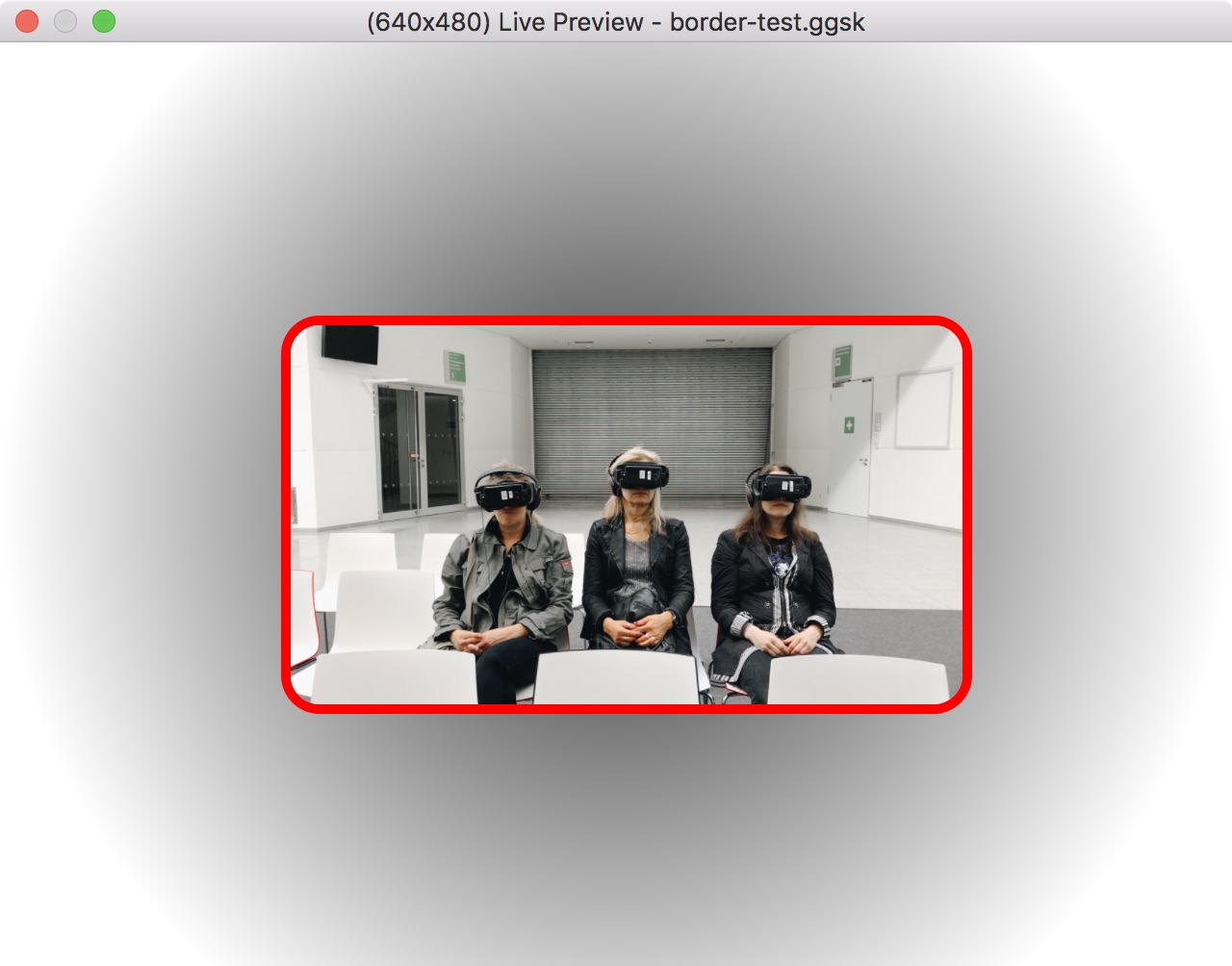
For example, an image element can have a border:
border-radius: 20px; border: 5px solid red;. This can also be entered with a
line break: border-radius: 20px; border: 5px solid red;
Keyboard Shortcut
Enter the preferred key to control the action defined to the element. For example, select the text field and press the Up Arrow key. Then add a Mouse Click action. The element performs the action when it’s clicked or when the Up Arrow key is pressed. Click Clear to remove the shortcut.
Exclude from Translation
Select this option to not include this element in the skin’s translation file.
Safe Area
Available for the Container Element.
Select Use Safe Area for Position and Size to keep child elements of the container inside the safe area of the device. This option makes sure that the elements are always 100% visible and the skin will automatically react to the device’s safe area.
Make sure Ignore Safe Area is not selected in the HTML template settings in the Web Output.
Actions
Actions or a set of directions can be applied to any element added to the skin to create interactivity.
Double-click in the Actions area or click the plus sign to the right to open the Action Settings.
See Skin Actions, for details on all actions.
Modifiers
Adding modifiers allows you to make elements move, scale or rotate when the panorama is being panned, tilted, zoomed or loaded. A good example of a use of a modifier is for a loading bar that scales in relation to how much of the panorama has been loaded.
Double-click in the Modifiers area or hit the plus sign to the right to open the Modifier Settings.
See Skin Modifiers, for more details on all modifiers.
Notes
Use this section to add information about the element. This is especially useful if you have a component and want to explain the elements inside that component. The notes field uses your system’s spell checker.
Notes will show up as tooltips in the Tree.