Skin Editor Properties
The Properties section is where the settings for the skin and elements are located. It also holds the settings for the Canvas and the skin itself. All the properties are grouped in collapsable panels.
The Properties panel shows the skin settings when no element is selected. To deselect an element and return to these settings, click in the outer part of the canvas.
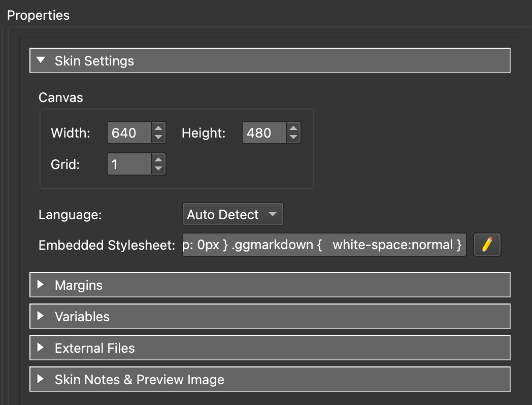
Skin Settings
Width & Height – Adjust the canvas’s width and height, from 0 to 2000 pixels. To get a better idea of how your skin looks on output, set the size to the project’s output window size.
Grid – Adjust the canvas’s grid in pixels, from 0 to 99. For example, a setting of 10 creates a grid of 10 pixel squares.
Language – This sets the language for the skin. Auto Detect is set by default. Poedit then detects the language based on the content in the POT file. However, you can set a specific language, which may be useful if the content has mixed languages. See: Translating Skins
Embedded Stylesheet – Add CSS code to apply to the whole skin. See: Embedding Fonts
Margins
Use margins to set extra space outside of the panorama window (Top, Bottom, Left, Right) to display elements. These elements could be anything from maps, thumbnails and buttons. Set the amount of margin as pixels or percentage.
Variables
Variables are powerful little tools that can help simplify automation within a skin. Variables hold a value and that value can change. Give the variable a name, and a value based on its type: Number, Text, True/False.
You can create an action based on a variable’s value. For example, you can create an action that will only trigger when that variable’s value is true.
Or, you could use a Set Variable Value action to change the variable’s value and then use a Logic Block that uses a variable as a trigger. This method can be used to hide and show elements with a single action.
Variables can be used as custom triggers in Logic Blocks.
Each variable has the option to apply a Logic Block.
Add variables to the variables table by double-clicking in the table or clicking the +.
Name
The name of the variable. This will show up in the Triggers list in a logic block, in the placeholders list in a textbox, and in the Set Variable Value Skin Action.
Type
Choose the type of variable:
Number – The value is expressed as whole or decimal numbers.
Text – The value is expressed as text or string.
True/False – A boolean type value using true or false.
Init Value
This is the variable’s base (default) value and it depends on the variable type. For example, if the Type is set to True/False, the Init Value can only be either true or false. Apply Logic Blocks here.
Expose
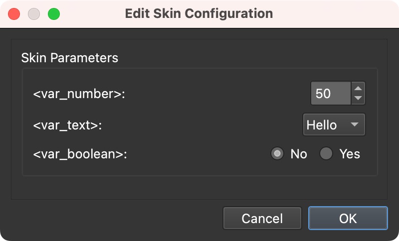
Click to expose and open the Configure Exposed Variable dialog. This exposes the variable in the Skin Configuration dialog in the web output and allows for skins to be easily configured for the needs of each project.
Option-click (macOS) or Alt+click (Windows) the column to bypass the Configure Exposed Variable dialog and turn the exposure on or off directly.
Configure Exposed Variable
Expose – Select to expose the variable in the Skin Configuration.
Limit – Provide boundaries the exposed variable should work within.
- None – No limits
- Maximum/Minimum – Provide a boundary range for number variables, enter a number range. Choose display this range with a number chooser (Spin Box) or as a Slider. Use Precision to set the number of decimal places for the value.
- List – Create a list of options to choose from as key value pairs. For example Key = 1, Value = Hello; Key = 2, Value = World. Choose to present the values as a Dropdown (combo box) or radio buttons (multiple choice).
Description
An optional description of the variable. If you expose the variable, this description will appear as the label in the Edit Skin Configuration dialog in the Web Output.
Source
This column will show the variable’s source as an icon. These variables are added from Project Variables (i.e. from Animation Editor) and Custom Properties in User Data and Hotspots. Click the source icon to change a variable’s source. This is useful if you’d like to have a variable access the hotspot triggers in a logic block. This way, the variable does not have to be defined in the project, just the skin which would make it possible to use in a component.
Rows can be adjusted by dragging on the handles to the left of the row.
Project Properties
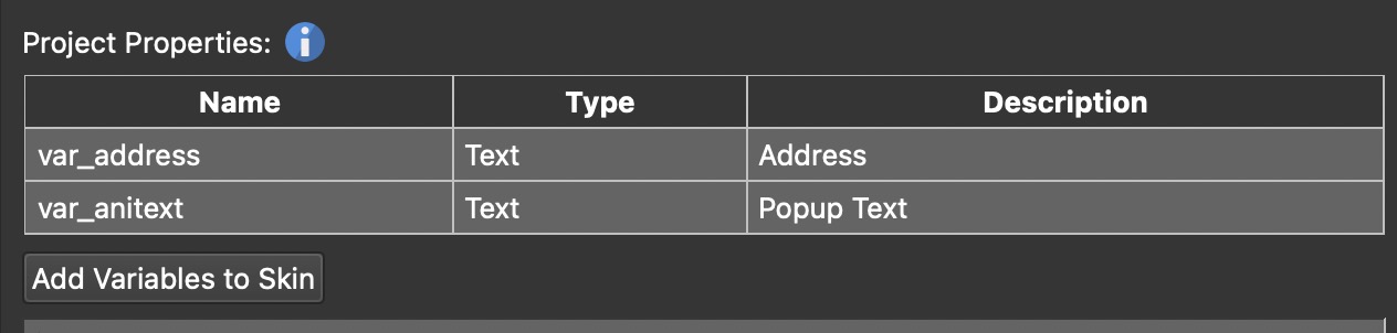
This table lists variables that are defined as properties in your project, from the Animation Editor, User Data, and Hotspots, but are not part of the skin. It appears once you remove such a variable from the variables table (using the X in the table). To add them back to the skin, click Add Variables to Skin.
Context Menu
Right-click any variable to open the context menu.
- Cut/Copy/Paste – Cut, Copy, and Paste variables.
- Insert Variable Above – Add a variable above the selected row.
- Delete All Variables – Removes every variable from the table after you confirm it. Undo puts deleted variables back in their old place.
- Rename – Opens Search. Enter the new name in the Replace field. Click Replace to rename the variable everywhere in the project.
- Find Usage – Opens Search and lists all elements where the selected variable is used.
External Files
Use this table to apply your own external script files. You can choose between JavaScript and CSS. Add the full path URL in the URL column. Rows can be adjusted by dragging on the handles to the left of the row.
3D
Stacking Strength – Choose how strongly elements that are stacked on top of each other are kept apart in 3D nodes. Use the numeric control to type a value or click the up/down arrows to adjust it. The allowed range is 0.25 to 9.99, in increments of 0.25.
Elements that are stacked on top of each other, such as a parent and its child, sit on the same plane in 3D. Pano2VR keeps them apart so that they cannot cut into one another, and this setting scales how much room each step of the stacking order is given. The default of 1 suits nearly every project, at any distance from the camera and whatever the node’s clipping planes are set to.
Raise the value if elements of a hotspot flicker or cut into each other in a 3D node. Lower it only in the opposite case, if an element of a deeply nested hotspot appears in front of model geometry that should cover it.
Skin Notes and Preview Image
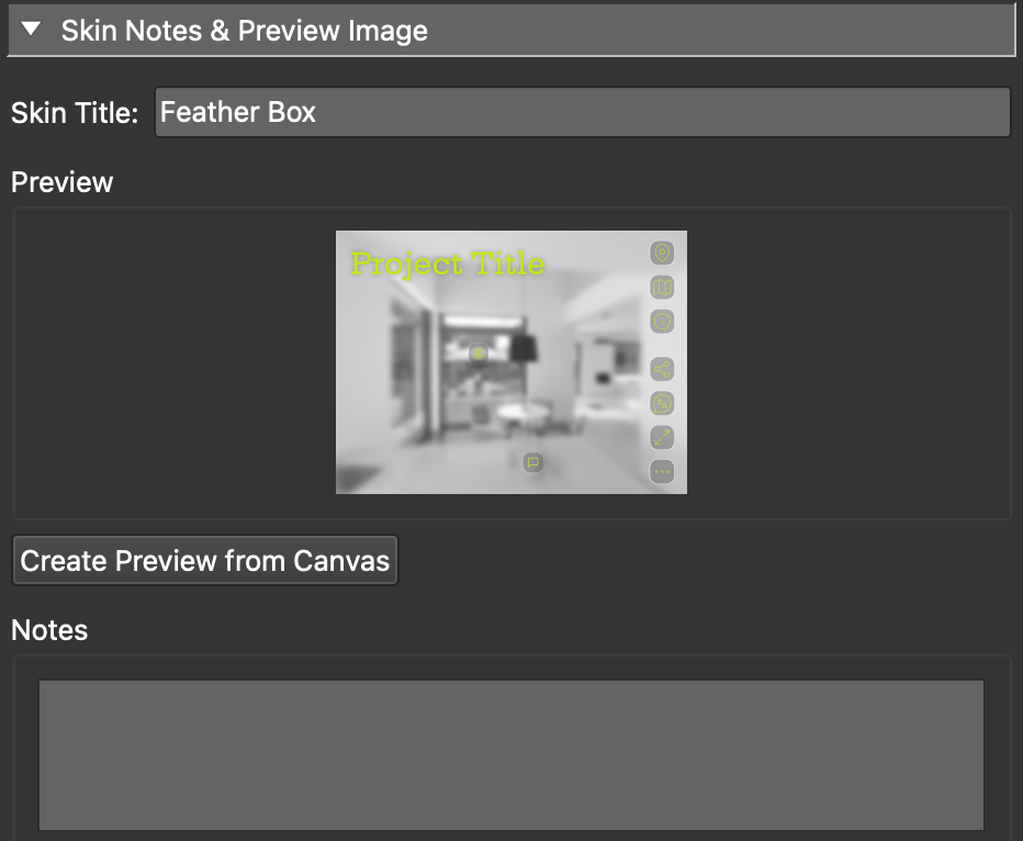
Use this section to give the skin a title, add notes, and a preview image of the skin for a visual reference.
Do any of the following to add a preview image:
- To use a preview of the canvas, click Create Preview from Canvas. This will take a snapshot of the Canvas and apply it as a preview.
- To add your own preview image, right-click in the Preview area and choose Change Preview Image. Navigate to your image.
Note that the images will be cropped to a 4:3 ratio.
Element Properties
The properties will change to show the settings for the active element. Learn more about each element’s properties.
Each skin element can have ARIA content added. This content can also be translated and will appear in the POT file.
Sound
Select a sound in the Tree to show its settings. A skin sound belongs to the skin rather than to a node, so it keeps playing when the viewer moves to another node. Control it with media actions such as Play Media, or pick it as the Media Element of a Seekbar.
ID – The name that media actions and the seekbar use to address the sound.
Level – The volume of the sound, from 0 (silent) to 1 (full volume).
Loop – Choose how many times the sound plays. Enter 0 for an endless
loop, or -1 to keep the sound from starting on its own, for example when a
button starts it.
Preview – Click to play the sound in the Skin Editor, and click again to stop it.
Working in Properties
Below you’ll find a few tips and shortcuts that will help you customize your workspace and speed up your workflow when working in the Properties.
Switch to Solo Mode in the Properties
To show only one pane open at a time, do one of the following:
-
In the menu, choose View > Properties Solo Mode.
-
Press Shift-Command-P on macOS, Ctrl+Shift+P on Windows.
-
Option-click (macOS) or Alt+click (Windows) the pane header.
-
Hover your mouse over the right edge of the pane header and click the ellipses button.
Open or Close All Panes
Command-click (macOS) or Ctrl+click (Windows) a pane header to open or close all panes at once.
Step Through the Panes
Press Shift-Command-Page Up or Shift-Command-Page Down on macOS, Ctrl+Shift+Page Up or Ctrl+Shift+Page Down on Windows, to show one pane at a time and move to the previous or next one.
Show or Hide the Actions and Modifiers Panes
For the Actions pane, press Shift-Command-A on macOS, Ctrl+Shift+A on Windows.
For the Modifiers pane, press Shift-Command-M on macOS, Ctrl+Shift+M on Windows.
Pressing these shortcuts again closes the pane and returns the other panes to their previous state.